Showing posts with label Clara Clarke-Osbourne. Show all posts
Showing posts with label Clara Clarke-Osbourne. Show all posts
Sunday, 27 February 2011

Friday, 21 January 2011
Evaluation
Q.3


 Blogger: has brought together a mixture of media technologies that worked on single platform. It allows me to upload video clips, images and insert text etc.
Youtube: has enabled me to watch music video and view comments from the videos. Youtube has also giving access to watch other artist videos to get inspiration for my video. I watched the original version of unwritten on youtube and from watching it i was able to look at ratings, comments etc. We watched the video by Natasha Bedingfield and took elements and concepts from to put into our video. If youtube wasn't around it would have been harder for this to happen.


 Final Cut Pro: This software helped me put together our music video, without the software it would have been difficult to make music video. I've learnt how to use the transactions effectively and leant how to edit properly. Tools such as the cutting tool was easier to use as i've used it before. However editing by layering clips was a totally new concept.


How did you use the media technologies in the constructions and research, planning and evaluation stages?
Photoshop : enable me to create an idea from paper to a digital media form, with the help of certain graphics and elements i used. During the course of filming the i took photos of the artist that i wanted to use for my ancillary production work. I applied soft graphic to transform the image and make it suitable for the digipak and advertisement. I also used certain graphics to over lap pattern to make the images link together.


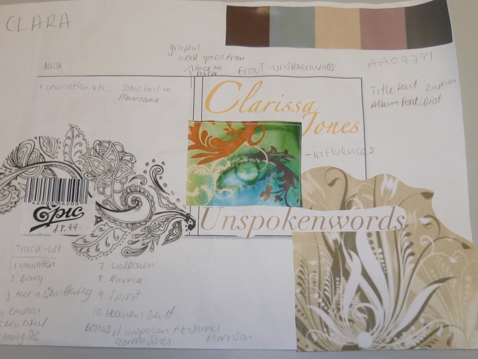
Graphics and element i used to help me create my ideas from paper to digital image.

 Blogger: has brought together a mixture of media technologies that worked on single platform. It allows me to upload video clips, images and insert text etc.
 Youtube: has enabled me to watch music video and view comments from the videos. Youtube has also giving access to watch other artist videos to get inspiration for my video. I watched the original version of unwritten on youtube and from watching it i was able to look at ratings, comments etc. We watched the video by Natasha Bedingfield and took elements and concepts from to put into our video. If youtube wasn't around it would have been harder for this to happen.


 Final Cut Pro: This software helped me put together our music video, without the software it would have been difficult to make music video. I've learnt how to use the transactions effectively and leant how to edit properly. Tools such as the cutting tool was easier to use as i've used it before. However editing by layering clips was a totally new concept.

Evulation
Q2.


How effective is the combination of your main product (video) and ancillary text (digipak and advertisment) ?


Tuesday, 18 January 2011
Evaluation
Q1.

 Watching the Notting Hill clip put our whole idea into prospective. We wanted our artist to simply walk in the music video and be connected to the words of the song. But by having her walking through a visual nice surrounding that mirrored the lyrics of the song. This idea came from the scene when Hugh Grant walked through a market place accompanied by music from by Bill Withers. What works well in this scene is the connection between the visual aspects, the editing/ camerawork and the lyrics of the song. They all fitted well with each other for example; the continuity editing and the tracking technique was very good. It made viewer's see past him just walking but made the audience look into his thoughts and other people life's in a time scale.
The original video by Natasha Bedingfeild was very hard to match but we wanted to keep the concept of the of video similar. We watched the original video and took elements from it e.g location types and main theme. We used close ups of our artist for an intimacy connection with the audience. Our artist changed costume twice in the video to help establish the different locations in the video. This follow the conventions of the genre. The original video helped me set the theme for my ancillary products. I watched over the videos and wanted a to go for a simple look. I chose the colour scheme from Natasha Bedingfeild video and came up with paisley floral pattern to cover the DigiPak and Advertisement.


In what ways does your media product use, develop or challenge forms and convention of real media products?
The influences for our artist music video came from I should be so lucky Kylie Minogue, a scene from the film Notting Hill and the original Music video Unwritten Natasha Bedingfield. The whole visual aspect of each video/clip fit into ideas and thoughts we wanted to put across to the artist audience.

When planning the music video we watch Kylie's video for ideas that we could mimic by creating something new. The clothing and different location types made the video standout and memborable. And that's what we tried to achieve with our artist' video. Some of the camera work in Kylie's video wasn't good in all areas but there were many shots, which we lacked of. So we made sure the artist clothing was suitable for the genre and noticeable for the audience.
 Watching the Notting Hill clip put our whole idea into prospective. We wanted our artist to simply walk in the music video and be connected to the words of the song. But by having her walking through a visual nice surrounding that mirrored the lyrics of the song. This idea came from the scene when Hugh Grant walked through a market place accompanied by music from by Bill Withers. What works well in this scene is the connection between the visual aspects, the editing/ camerawork and the lyrics of the song. They all fitted well with each other for example; the continuity editing and the tracking technique was very good. It made viewer's see past him just walking but made the audience look into his thoughts and other people life's in a time scale.
 E.g at the start of the clip the audience see a pregnant women and towards the end the same women appears with her child. The idea of going through a journey was based off that one small link between growth over a short period of time.
The original video by Natasha Bedingfeild was very hard to match but we wanted to keep the concept of the of video similar. We watched the original video and took elements from it e.g location types and main theme. We used close ups of our artist for an intimacy connection with the audience. Our artist changed costume twice in the video to help establish the different locations in the video. This follow the conventions of the genre. The original video helped me set the theme for my ancillary products. I watched over the videos and wanted a to go for a simple look. I chose the colour scheme from Natasha Bedingfeild video and came up with paisley floral pattern to cover the DigiPak and Advertisement.


link between each video.
Sunday, 16 January 2011
Evaluation
Q. 4.
What have you learned from your audience feedback?
( I plan to answer this question by creating a sort film that consist of narrative voice over, images and clips from the music video.)


I went to watch my music video at the screen on the green. The response from the audience was amazing and the feedback was good also.
There was three point people constantly mentioned when i asked them "what did you think of my video?"
1. The use of the photo montage
2. Editing wasn't smooth
3. Using a wide angle lense.
One person said "i didn't understand the images at the interlude... it doesn't fit in the conventions of indie pop." * ( image of a person with a speech bubble above their head + quote )
Others said the Editing wasn't smooth, *( add 10 sec clip to show example )
The last quote stated " i you used a wide angle lense camera, your music video would have been easier to watch. "
From what people have said I've learned that my music video broke the conventions of an "stereotypical" indie/ pop video. By using the photo montage at the interlude of the song. If i were to make the music video again i would, take out the images and replace them with various shots. Also i would the editing sharper by cutting on the beat accurately, i would put in more shots throughout the coarse of the video. This will make the video enjoyable to watch and make viewer's feel more connected. * ( add images from the indie pop genre )


.jpg)


Planning Fonts, Colours and Layout
I'm considering this font style but it's curly to read.
 I will use photoshop for my digipak and advertisement.
 |
| Lucida Handwritting |
I like this font because it's fits well with my theme.
I'm considering this font style but it's curly to read.
 |
| Mongolian Baiti |
 |
| French Script MT |
This font is very nice but it hard to read however the style suits my theme.
I want my colours base around the clothing and setting of the music video. Choosing beige, pink and pink nude compliments each other well. 

 I will use photoshop for my digipak and advertisement.
 Saturday, 15 January 2011
CLARA'S BLOG
Clara won't be able to post her evaluation blog until tomorrow because her modem stick isn't working and she getting one tomorrow.
Friday, 14 January 2011


Tuesday, 4 January 2011
Moc Up of Digi Pak and Advertisment


Sunday, 5 December 2010
Indie Pop Digipak's


Indie Pop Advertisement
 |
| Piture of Artist |
The first Advertisement is of Indie Pop artist called; A Fine Frenzy. Her music isn't like most Indie Pop out; it’s mellower and most of her songs have meaning behind them. Her debut album is called One Cell In The Sea. The album features songs Alison Sudol (A Fine Frenzy) is recognised for; such as Electric Twist and Happier. Her target audiences similar to Clarissa Jones as they music is of the same genre.
A Fine Fenzy, album On Cell In The Sea.
 |
| Album |
 |
| Picture of Artist |
 |
| Album |
 |
| Picture of Artist |
The third Advertisement is of Sade. Her music different to the other two artist, but she has elements of Clarissa Jones’ style. Her target audience is of the Indie Pop genre.
 |
| Album |
Below are some videos of the above artists.
Subscribe to:
Posts (Atom)