Showing posts with label Sukru Taskiran. Show all posts
Showing posts with label Sukru Taskiran. Show all posts
Sunday, 27 February 2011

Saturday, 15 January 2011
Evaluation Question 4

I HAVE MADE A WORDLE, THESE WERE SOME OF THE FEEDBACKS STUDENTS HAD USED IN OUR MEDIA CLASS.
Evaluation Question 3
In the clip it states it is question 4, but in fact it is evaluation question 3.
"I have used the word transaction, what i meant was transition. "
Also i have used to photoshop elements 4.0 to do my digipak because while using photoshop there are set in layers in order to edit a specific item instead of editing the whole image.
I have also used a site called wordle to make a image of words, the words were feedbacks from students from our media class.
Friday, 14 January 2011
Evaluation Question 1
http://www.youtube.com/watch?v=tlP89pMc3UM (Notting Hill, Ain't no sunshine)
A couple of shots we had in the music video.


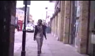

A couple of shots we had in the music video.

Medium close up
medium shot

medium long shot
long shot

Establishing shot
Friday, 7 January 2011


Friday, 10 December 2010
Mock of advertisement

Also the dates for the tour's would be on their, it doesn't show well on this image. Also the image positioning would be different.


Photos that i would use in my digipak and advertisment

This image is going to be on my front panel as the artist is looking straight at the camera showing us the relation with the audience. The image is also is a medium-close up shot which is suitable for the front panel.

This image is going to be in my inside panel, i think this is suitable as it is taken from one of the videos from the album, which shows her joyful.
Tuesday, 7 December 2010
Analysis of 3 advertisements

This got my attention as i like the artist name and album titles positioning which i would be using on my digipak.

The colours are well thought about, as i like the the colours of the artist whcih goes well with the background, something i will have to think about.

This is another very good one, as it has the front panel of the digipak. it also shows the extra information needed, also eye catching as people would want to see the image that is on the black background.
I might use a black backgorund so my artist would stand out.
Analysis of 3 digipaks


It has a continuous colour scheme (blue) all the way threw was looks good. The font cover looks like it is aimed at younger audiences because it looks like its from some kind of fairy tale.

I think this is a good one as i like the contineous style of the CD case going threw 3 panels then another two comeing from the middle.

I really like this one as it has a continious background going threw the panels. It gives it the affect that it is a digipak and not a CD cover.
Overview of do's and don't
For our Digipak covers and magazine adverts, we had learnt what to do and not what to do.
We was suggested to,
· Use a clear font
· Use clear photos that are in focus
· Use photos that are appropriate
· Use appropriate sizes for images and fonts
· Use appropriate type face that follows both genre conventions and a house style
· Follow the convention of the 3 colour rule and use colour that is appropriate for images, fonts and backgrounds
· Use appropriate industry logos and conventions, properly positioned, e.g. Barcode, date, copyright, titles and artist name.
We was suggested not to,
· Stretch images because they would make them out of focus
· Use layer styles
· Use unnecessary effects because any effects used must suit the genre
· Use a font simple because you ‘like it’
· Feel you need a separate photo on every panel
Monday, 6 December 2010
Short list of fonts, colours, layout and design ideas
Font
The fonts i might be using are,
- Calibri
- Eurostile
- Lucida Console
- Mongolian Baiti
Colour
The colours i am going to use are the colours of the cloths the artist was wearing in the music video,

These colours would be appropriate as they are bright colours which attracts audiences and goes with the genre of our music. (Indie/pop)
Layout and Design
My digipak is going to be a 4 panel digipak. The front panel would have the album title and a picture of the artist with a fancy effect. The back panel would have the track songs names and company logo, barcodes, etc. The inside panels would be one for the CD to be placesd and the other panel would have a big picture with of the artist.
Thursday, 2 December 2010
Analysis of at least one sequence from the rough cut
The opening sequence of our music video was not exactly making sense because we cut the the clips at the wrong bits. we couldn't realise it until our media teacher had spotted it our for us and told us when we was showing them our rough cut. So we had to go over the clips again in order to make it look better.
Friday, 26 November 2010
Rough Cut

Our teachers had viewed the rough cut of our music video and told us to do the followings,
- To add a fade into the begging of the music video and a fade out at the end.
- At the middle of the music video we had a shot lasting 30 seconds, we had to cut it to different shots on each beat.
- On our last verse of the music video our lip-synching was out of place so we had to fix that.
behind the scenes-Unwritten
This is a powerpoint presentation of behind the scenes of Clarissa Jones-unwritten.
Friday, 15 October 2010


Subscribe to:
Posts (Atom)